← Back to changelog Tobias Wochinger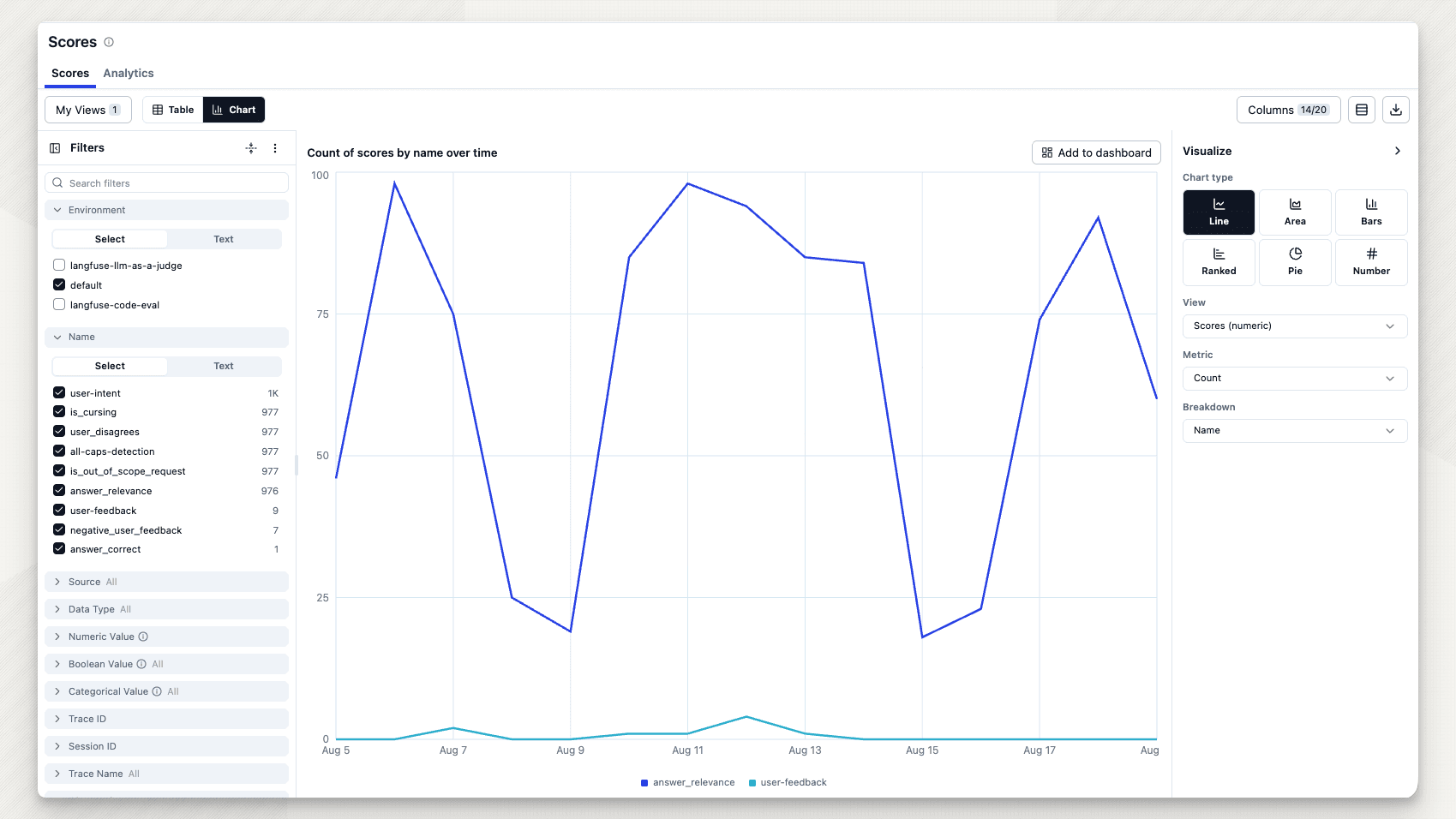
August 19, 2026
Turn scores into charts
Tobias WochingerTurn the Scores table into a chart, spot outliers, and save useful views to a dashboard.
You already filter the Scores table down to the rows you care about. Now you can turn that view into a chart in one click.
Use Table | Chart to visualize numeric, boolean, or categorical scores over time. Choose a metric, aggregation, breakdown, and chart type in the Visualize panel.
The Pulse strip highlights unusual scores, so you can jump straight to the underlying rows. When a view is worth keeping, Add to dashboard saves it as a dashboard widget.
Learn more
Was this page helpful?