← Back to changelog Steffen Schmitz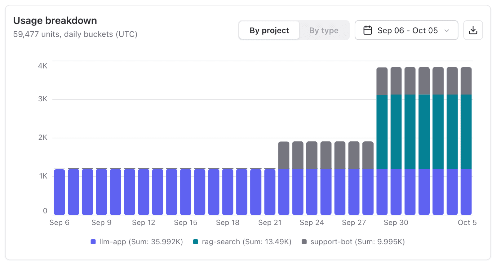
October 6, 2026
See which projects drive your usage
Steffen SchmitzA new chart shows your organization's units over time, grouped by project or type, with a CSV export. On Langfuse Cloud it is on the Billing page; self-hosted deployments get a new Usage page.
You can now see how your organization's usage develops over time and which projects drive it. The new Usage breakdown chart shows your units (traces, observations, and scores) as stacked bars across all projects of an organization.
- Find the project behind a usage spike with By project, then open that project to investigate.
- See what your usage is made of with By type, for example when an evaluator adds more scores than you expected.
- Analyze the numbers offline with Download as CSV, for example to split costs across teams. The file has one row per time bucket, project, and type.
Choose a preset from Past 1 day to Past 1 year, or a custom range of up to one year. Langfuse picks the bar size for you (hourly, daily, weekly, or monthly), and all buckets are in UTC.
Where to find it
The chart counts units the same way on every deployment. Where it lives and who can open it depends on how you run Langfuse:
| Langfuse Cloud | Self-hosted | |
|---|---|---|
| Page | Organization Settings > Billing | Organization Settings > Usage (new) |
| Who can see it | Organization owners | Organization owners and admins |
| Shown with | Your plan, invoices, and billing period usage | Usage only |
Was this page helpful?